Snips Display Typeface - Unlock Creative Versatility in Type Design
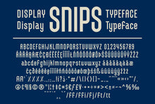
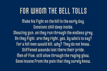
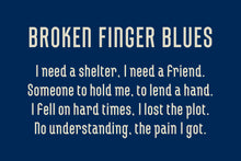
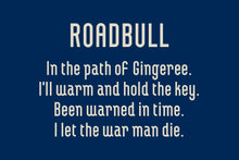
A Balance of Sturdiness and Customizability: Snips Display Typeface, a mono weight sans font, seamlessly merges robustness with creative flexibility. Built on a foundation of monoweight and geometric design principles, Snips boasts a utilitarian charm that extends beyond its initial appearance. While maintaining its sturdy appeal, Snips intentionally omits certain traditional letterform intricacies, making it exceptionally easy to dissect and personalize. Its modular construction welcomes both novice and experienced designers to modify existing typefaces according to their project requisites.
Font Key Features:
- Uppercase & Lowercase Characters for comprehensive design options
- Numbers & Punctuation to facilitate diverse typographic compositions
- Multiple Language Support to cater to global communication needs
- Single Weight consistency for uniformity in design applications
Discover Creative Potential: Unleash Customization: Snips presents a unique opportunity for designers to dismantle and reconstruct letterforms, fostering custom designs that reflect individual creativity.
Dynamic Variety: The modular structure of Snips not only invites experimentation but also paves the way for an extensive array of variations. This versatility is particularly valuable for those seeking distinctive aesthetics.
Ideal Usage Scenarios:
-
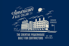
Lettering and Logotype Projects: Snips serves as an ideal foundation for crafting intricate lettering and engaging logotypes. Its modular design facilitates the deconstruction and reassembly of characters, enabling the creation of one-of-a-kind custom forms.
-
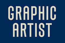
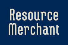
Headlines and Callouts: Whether you're designing for the working class or aiming to capture the industrial era's essence, Snips' robust yet adaptable nature makes it a perfect choice for headlines and callouts.
Forge the Path of Innovation: Snips Display Typeface marries traditional sturdiness with modern adaptability, aligning its design with both classic and contemporary visions. Experience the liberation to deconstruct and reimagine characters, ultimately crafting type designs that align perfectly with your creative vision.
Specifications: Snips Display Typeface comes with uppercase and lowercase characters, numbers, punctuation, and support for multiple languages. Its single weight consistency ensures uniformity in design.
Elevate Your Type Design Journey: Venture into the realm of innovative typography with Snips Display Typeface, where robustness meets boundless customization. Embark on a creative odyssey that redefines the possibilities of type design.

About the designer
KENDRICK KIDD
Jacksonville, Florida
Kendrick’s design work is as varied as the cereal aisle at your local grocer. His love for exploring new techniques helps his pieces stay fresh, and keeps Kidd engaged in the ever-evolving design community. Where some designers have used style to define their work, Kendrick unifies his portfolio with his approach. “I’ve always loved a great design execution, but the work I enjoy creating the most has a great concept behind it too”, Kidd says. This thread of thought becomes clearer the deeper you explore the themes and story vignettes in much of his work.
In addition to spending the last 20 years in advertising industry, Kendrick freelances for companies like, Target, Nickelodeon, Fitbit, and Nike to keep his skills sharp.
Find more of Kendrick's work here:
Kendrickkidd.com • Instagram • Dribbble


